
The End of Upwelling


What a difference a week makes.
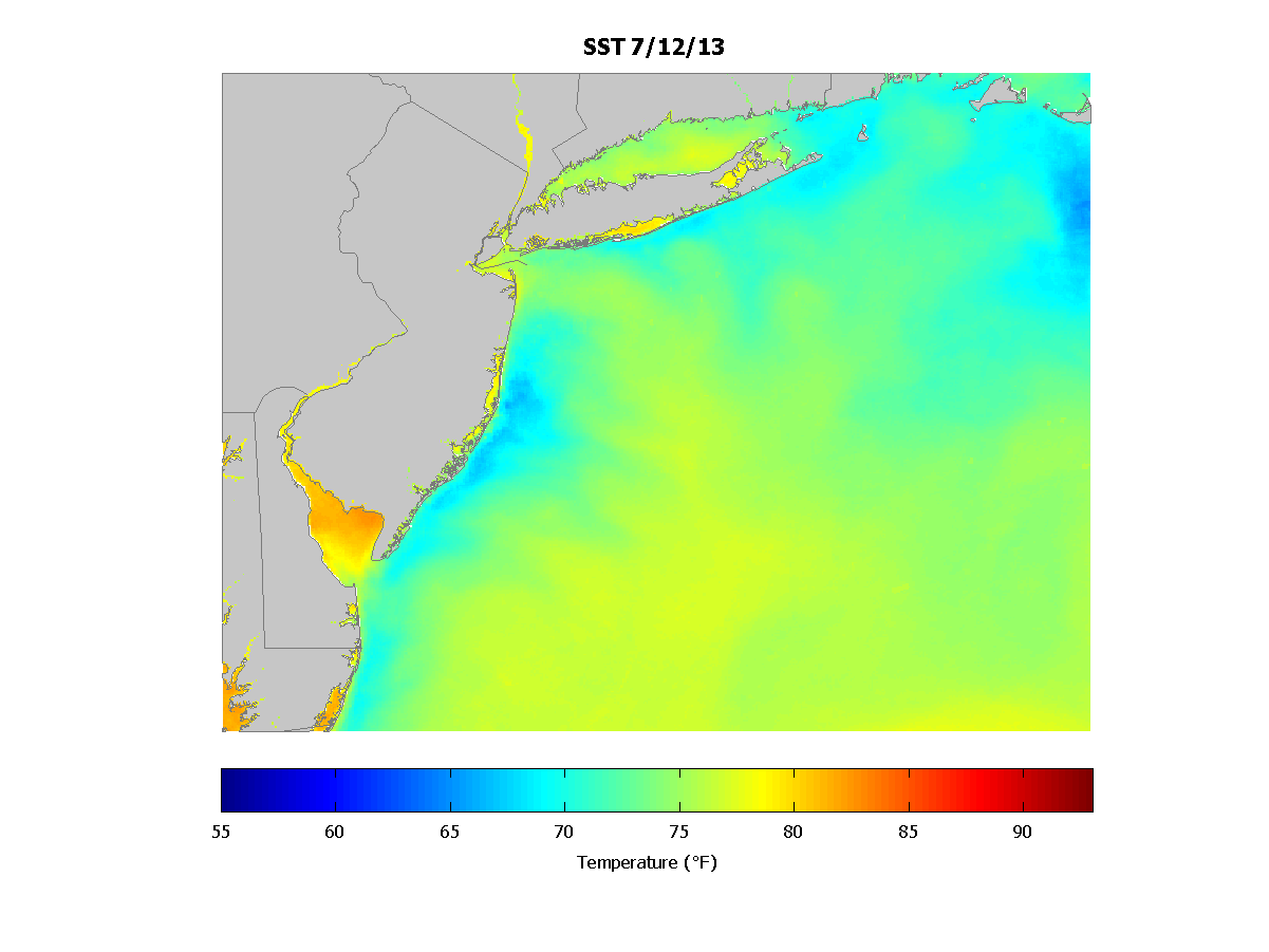
Late last week, the waters off New Jersey were between 5-15 degrees below normal thanks a persistent pattern of coastal welling in which warmer surface waters were pushed offshore and replaced by colder waters from below.
This year’s upwelling, which typically occurs this time of year, was longer than usual due to a strong Bermuda High. The High also stalled weather fronts along the eastern seaboard, carrying a lot of moisture up the East Coast from the Gulf of Mexico. But it was the upwelling that caused a lot of consternation among beachgoers in New Jersey, particularly on Long Beach Isltand where the upwelling was strongest. (Warning, the comments on that last link are a sad example of the urgent need for scientists to become more involved in communicating science.)
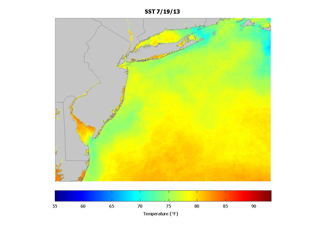
However, this week, the Bermuda High shifted west, causing record high temperatures across much of the East coast and odd rainstorms out west. It also reversed the coastal upwelling pattern enough so that surface waters could return to their seasonal norms.
The image above shows the change in sea surface temperature over the last week, between July 19 and July 12. (Technically, this map shows the difference between two 7-day composites, one ending on the 19th and the other on the 12th.) Almost the entire region warmed up a few degrees thanks to the strong sun and cloudless days we’ve had. But it is the coastal waters off NJ that increased the most, from 5-12 degrees Fahrenheit. The shift in winds allowed warmer waters from offshore to head back towards the coast, while at the coast, previously upwelled cooler waters were subject to downwelling.
For the ocean, and all the fish in it, this is a huge change to cope with in just a few short days. But if you’re at the beach, it means a more pleasant swim is in your future.
Image Note: I created a new colormap for this image that includes 4 color points instead of the traditional 2 for a divergent color scale (e.g. blue to white to red). Let me know what you think!


I like the colormap, but I am not sure white is neutral. Have you tried it with blue->green->red?
Can you give me an algorithm to convert a colormap range to LED RGB intensities?
White is often used as the neutral color in divergent colormaps, when you’re tryign to show the distance to two extremes from a common mid point. (See, for example this EOS article and the often cited Colorbrewer tool.) The main issue with adding green to the mix is that it makes the map far more challenging for colorblind users, though I guess it really depends on the exact hues you choose.
Scientists, at least the non-colorblind ones, are used to seeing rainbow colormaps, and so are accustomed to 0 being in the middle/green, that is, if the colormap limits are centered properly, which is another common problem. Personally, when looking at data that spans both sides of 0, I prefer 0 to be colored as white, so I don’t have to guess which color of the rainbow it might be this time. That also saves you from having to mentally tax your mind to figure out which areas of the image are positive or negative, which is typically what you want to do with this kind of dataset.